Leading the visual transition and rollout for Education Perfect

Systemising & deploying a rebrand in 6 weeks

Brand Identity / Campaign Design / Project Management
Project overview
I led the visual rollout for EP’s rebrand. While an external agency provided the core concept and starter components, I was the one responsible to roll it out across ANZ, Canadian and International markets. As the sole in-house designer, I had a six-week window to turn those starting elements into a growing system, covering a full website redesign, digital assets and a large range of print materials from merchandise and brochures to exhibition graphics.
Insights
The agency provided the appearance but they didn't necessarily provide the exact needs of our marketing output. To ensure brand consistency, I began to define the design language. I prioritised high-visibility touchpoints being exhibitions, merch and core digital assets to start with. This ensured that even as we moved at a fast pace, the brand remained consistent rather than feeling a range of one-off designs.

Process

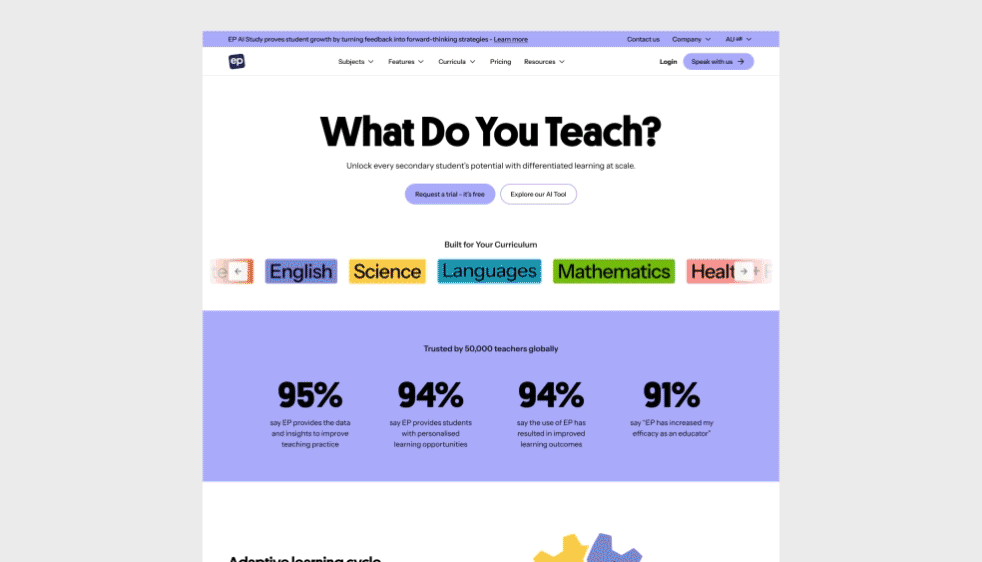
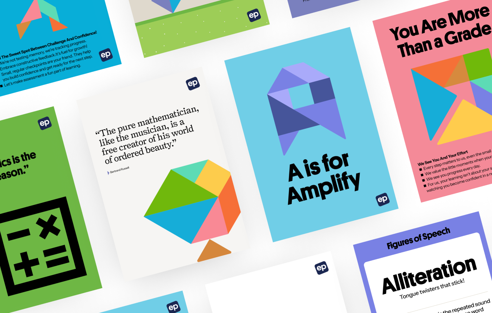
Because the brand guidelines were still being finalised while I was working, I adopted a framework first approach. I built the containers for the website UI and print templates ahead of time so I could skin them the moment the brand was locked. While waiting for final assets, I developed an interim visual style for social and email then moved into a high-volume production cycle to produce from whitepapers to event signage.

Outcomes

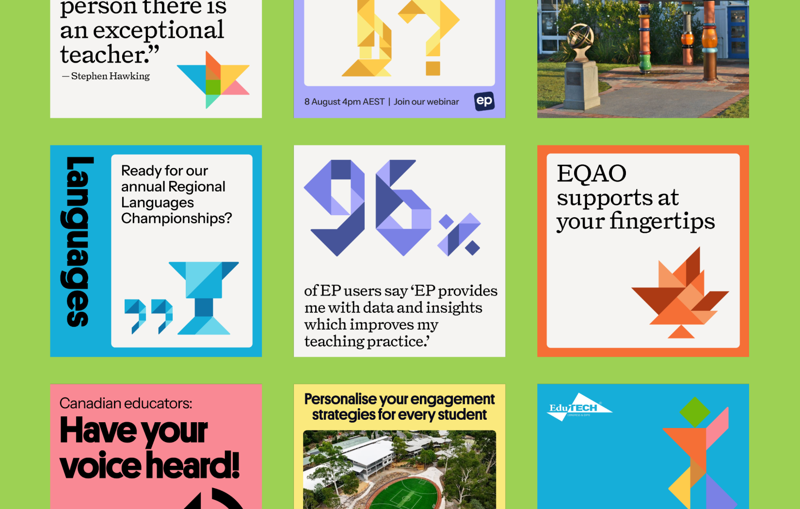
Our team successfully transitioned the brand globally without losing any marketing momentum. Despite the massive volume of work, I managed to bridge the gap between a digital and physical materials. Every piece of collateral, whether a flyer in Canada or a social ad in Australia were all a cohesive part of the same brand experience.

Next:

Evolving the Digital Identity - Education Perfect